
| Client: | Wellpartner, inc. |
| Capabilities: | Strategy, Branding, |
| Creative, Digital |
Seeing What You Have . . .
From A Different Perspective
BACKGROUND
The first thing a customer interacts with is the Company’s name, so it must convey the right message.
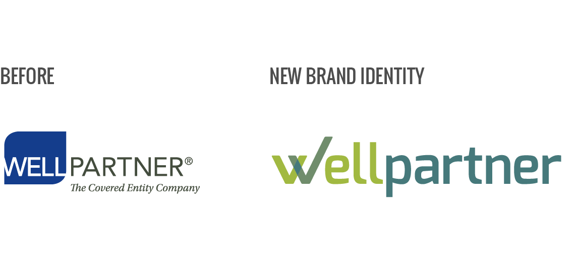
Even though the Wellpartner executive team wanted to change the company name, NobleRock Creative encouraged them to leverage their existing brand equity. However, it was clear from the research and findings conducted by both NobleRock and separately by Wellpartner that the existing brand identity and message platform offered nothing distinct or unique from that of any of the major competitors in the 340B space. Wellpartner’s leadership was extremely vocal about not wanting to be a “me-too” company.
As our Phase Two engagement commenced, our first actions were to develop a strategic message and positioning platform. Using the key brand attributes, we established guiding principles for our creative design process.
A strong brand is clear on its mission and stands up for what it believes in. Making a difference when it matters most.
SOLUTION – CORPORATE IDENTITY
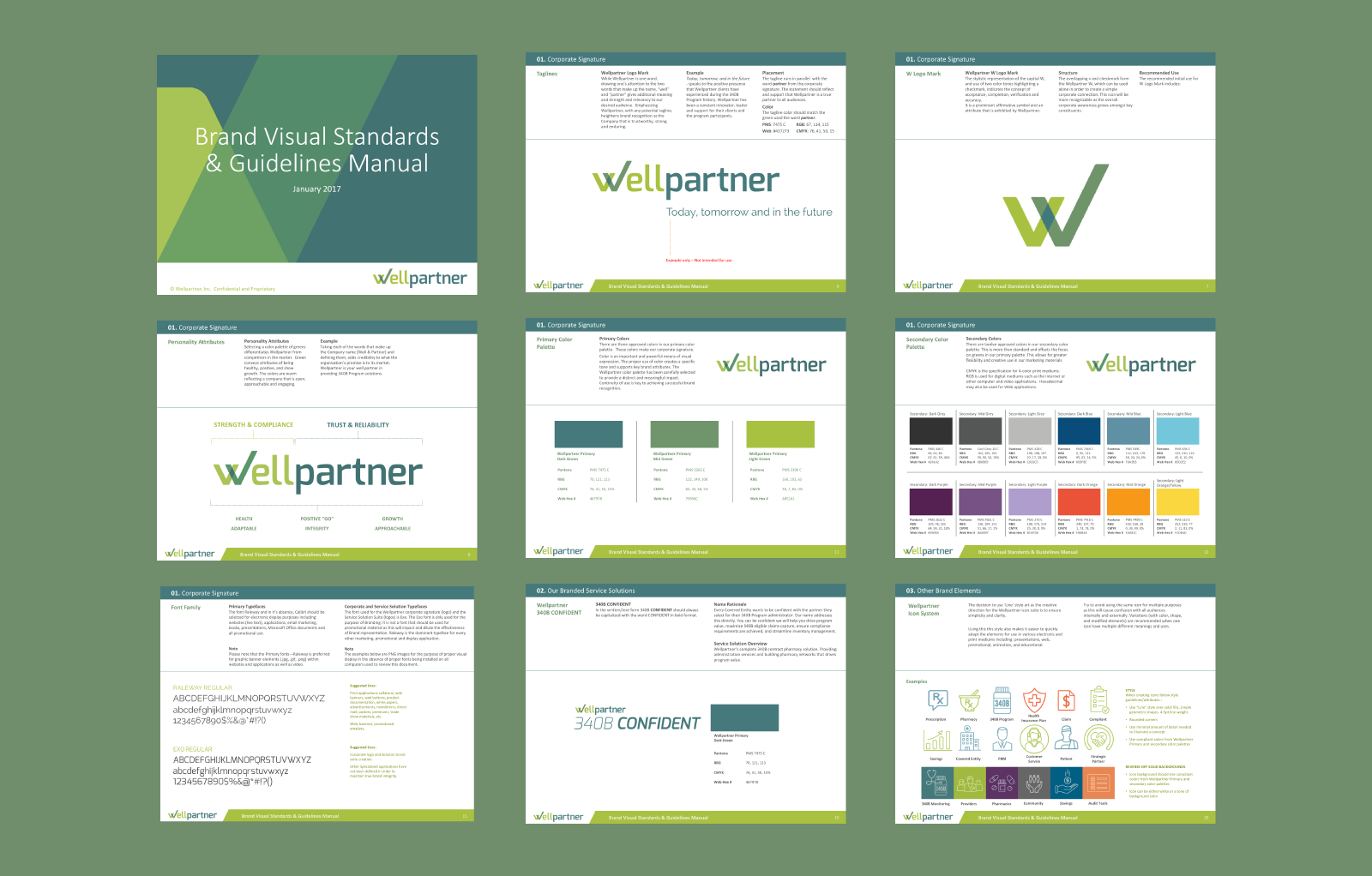
The new corporate identity elements reinforce trust and reliability. Simultaneously, while the color platform exhibits health and confidence, drawing from the newly established brand attributes.
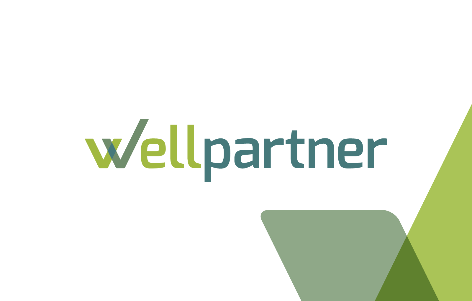
The creative design of the W conveys a message of partnership. The use of two green tones to form a check-mark is meant to illustrate – trust and compliance, key attributes of Wellpartner’s promise to their customers.

Design Concepts
Presented
SOLUTIONS – C-SUITE PLATFORM
NobleRock simplified the existing product suite platform and eliminated brands that were inaccurately positioned as products. We removed the over-used ‘ACCESS’ word from the suite and included the company name for continuity and broader corporate brand awareness and reinforcement.
We also repositioned the products as services and renamed many creating a C-SUITE platform that reflected a complete 340B program and pharmacy service solution. The new unified identity platform brings a unique look to a dynamic competitive landscape.
RESULTS
NobleRock has received tremendous appreciation, support, and compliments for the rebranding program. Launch at the 340B Summer Conference drew loads of customer and competitor attention. It was the perfect opportunity for the Sales team to re-engage with current customers and feel confident in pursuing new customers